Building a Flexible, High-Tolerance Brand for a Decentralized Free Software Community
Context
The Xalgorithms Foundation is Decentralized Collaborative Organization. It has contributors across time zones, countries and continents. More importantly, contributors may lend their expertise across a variety of working groups and disciplines. With projects ranging from monetary design, rules as data systems design, to agent based modeling, there is an ongoing effort to define and improve the tools and frameworks that facilitate collaboration. The focus of this piece is to define one of those frameworks: the brand.
Approach
The Xalgoirhtms Foundation has been engaged in ongoing exploration of the tools and frameworks needed to facilitate decentralized collaborative work. A brand is an important component of this toolkit. There is a reflexive quality to the metaphors of a brand. They are used to define a shared sense of identity and direction. At the same time, these narratives can be used to examine the characteristics of the organization. With this in mind, the approach taken to the task of branding is influence both by the disciplines of marketing and user experience. The question is not only what ought the brand be, but how ought people use this tool.
Before going any further, it is worth asking: is a brand the right tool for the job? In a Headless Brand Shorin et al write:
Brand is one of the strongest assets for decentralized protocols. A headless brand strategy is an ecosystemic affair and entails the mobilization of a decentralized set of actors. At its core, it revolves around giving agency to different stakeholders in a way that lets them coordinate more effectively and feel connected to the brand.The authors, also helped to clarify the need for a visual distinction between a protocol's brand and software used to interact with it.
From this perspective, a coherent brand strategy may be even more important for a decentralized, community driven protocol, than for more traditional forms of organization. Through image and metaphor a brand generates a shared sense of identity and directionality. In organizations, with high levels of in person interaction these concepts are easily share through conversation and interpersonal exchange. However, for distributed and decentralized organizations, maintaining a shared sense of mission is more challenging and requires guide posts; chief among them the logo-mark.
Guiding this process are principals defined in the DWDS technical paper See the DWDS Paper for a full discussion of the guiding principals. These principals inform the philosophy that undergirds the design of DWDS. At the same time, these principals provide a framework that informs the intention of work supported by the Xalgorithms Foundation. I highlight the following as being most crucial in guiding the development of a logo-mark:
Tolerance
Many people have encountered the concept of tolerance in relation to the UX principal of accessibility.Tolerance is also deeply connected to the philosophy of general purpose technology. Both of these disciplines embody qualities of tolerance. Joseph Potvin describes the Tolerance as follows:
Tolerance encompasses a designer’s spirit of respect for the prerogatives of those who are users of a design, or who are subject to its result, but also those across the community of other designers who would engage with the designed work in their preferred ways, for their own purposes, within their chosen domains, using their preferred technologies, and interpreted in the contexts of their respective normative paradigms.Again, see the DWDS Paper
Tolerance then has to do with flexibility. But it also has to do with maintaining a resilient underlying structure that enables the accomplishment of of a coherent set of tasks. It requires thinking through what can enable a wide variety of use-cases, but crucially does not require (and likely cannot) consider every possible use-case beforehand.
Least Power
Least power is a paradoxical kind of simplicity. It does not refer to a process that dumbs-down, or attempts to reduce complexity. Rather, least power refers to an elegant collection of inputs that are capable of producing more than the sum of their parts. It is the combination of discrete affordances that together are capable of enabling complex outcomes. This principal is most often employed in the context of programming languages.
Strength is a weakness when it comes to programming languages. The stronger and more expressive a programming language is, the more complex its code becomes. [...] Complex programs are more difficult to reason about and harder to identify edge cases for. [...] The less the language lets you do, the easier it is to analyze and prove properties.Qureshi, writes in "A hacker stole $31M of Ether — how it happened, and what it means for Ethereum"
However least power can also find meaning in a visual language, in the roles and strategies that comprise and organization, or in the narrative tracks that guide the organization. The results of a process that is attentive to the least power principal may appear simple. However this simplicity embodies a profound generative potential.
These principals provided the foundation for the logo mark. The mark needed to represent two core concepts guiding the Xalgorithms Foundation
- the development DWDS as the thread unifying working groups.
- the growth and development of the organization to enable the development of this core technology.
Representing the aspiration of completing reference implementation of DWDS could be represented with the concepts of Quaternary logic and tabular programming.The challenge became how to speak to these concepts with resorting to the visual language of the XRM dev interface. For many reasons it was important to keep these two elements of visual design distinct.
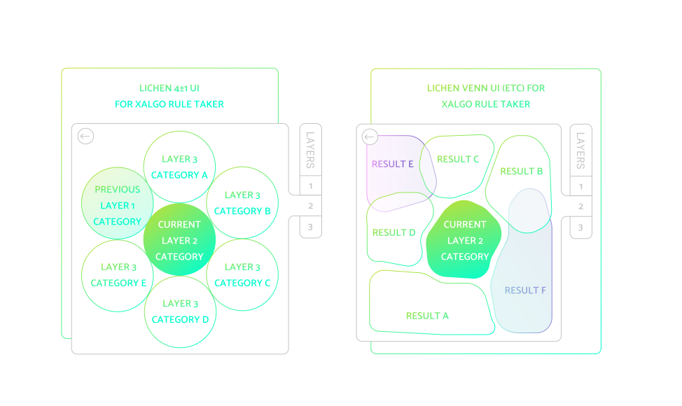
Representing the second aspiration was more challenging. The answer began to come into focus looking back at previous design work undertaken for the Xalgorithms foundation. The previous website iteration, and the prototypical lichen interface provided a plausible visual language. Lichen is a UI designed to highlight multiple pieces of data without imposing hierarchy of an unordered list. The use of circles, and the organic forms provided inspiration for how to represent the quaternary logic in a visually divergent way.
A sketch of what the Lichen interface could look like.
Similarly, this visual language connected to the second aspiration of the redesign: to inform the growth and capacity of a decentralized collaborative organization. The circles of the lichen interface coincide with the organizational image of "operational bubbles." In Managing the Unexpected: Sustained Performance in a Complex World Karl Weick and Kathleen Sutcliffe describe how some high reliability organizations (HROs) utilize the metaphore of bubbles to represent the spheres of collective sense-making held across individuals in collaborative environments Weick, Karl E, and Kathleen M Sutcliffe. “Managing the Unexpected: Sustained Performance in a Complex World.”. This shared vision is crucial in enabling performance in autonomous and semi-autonomous working groups.
Combing all these elements, the logo mark reference the concepts of quaternary logic and tabular programming. The mark also represents the history of the organization, while at the same speaking to critical organizational goals.
Results
Use the mouse to interact with the logo to see how it could function as a complex system.
This is a simple yet flexible mark. As a designer, I claim no monopoly over the identity. The fact that I did not produce a lock up is intentional. The community is encourage to reproduce the mark on their own, and assemble it in the manner most fitting to their needs.
// a constellation among the stars
*                           *         .
    ●  •  ●        *
    •  ●  .          .
    ●  .  •                                     .
.                           *
![]()
For example It can be constructed in a digital paint tool. It can be sketched by hand. Or, it can be rendered in ASCII characters. Similarly, the logo can be reconfigured, to represent working groups within the foundation. changing the sizes of the circles and the way in which the grid is broken, new working groups can be distinguished.
The success or failure of the logo-mark cannot yet to be determined. This redesign is one element in a broader campaign to enable the growth and performance of this decentralized collaborative organization. As additional tools, frameworks and strategies are defined, it is my intention to share them here. As they are deployed, I hope that these affordances will result in measurable improvements in the number of collaborators, quality of collaboration and ability to raise funds. Time will tell.

Calvin Hutcheon
Calvin has contributed conceptually, graphically, and technically in the product design, brand design and front end development spaces for Xalgorithms projects since mid-2019. Calvin is interested in free/libre/open source design processes, and is drawn to designing interfaces that accommodate the complexity of living relationships.